|
UVa Physics Computer Facilities
|
Using Gnuplot
Some Notes About Gnuplot
========================
* What is Gnuplot?
----------------
Gnuplot is a general-purpose plotting/graphing program that is quite
flexible and surprisingly powerful. It can graph 2- and 3-d functions
defined by the user. Gnuplot also has a wide array of built-in
functions, covering trigonometry, as you might expect, but also
extending to bessel functions, the gamma function, the error function
(erf) and many others.
Gnuplot can also plot 2- and 3-d data. Data can be read in either
ascii or binary format. Since Gnuplot allows you to specify the
layout of the data file, it can accommodate many different file
formats.
Gnuplot is cross-platform (Linux, Windows and OS X), and it's free and
open-source.
Gnuplot is command-line driven. This means that you can write scripts
and re-use them later, and it makes it possible to easily tell other
people what you've done. The program also has very good built-in
help. Just type "help" at the Gnuplot command prompt, and you can
browse through documentation for every feature.
Gnuplot has been around for many years and is widely used, so there
are many Gnuplot experts on the Web, offering useful advice. You'll
find many Gnuplot demos on the Web. Here's a trio of particularly
informative sites:
http://gnuplot.sourceforge.net/demo/
http://www.gnuplotting.org/
http://www.gnuplot.info/screenshots/
* Plotting functions:
-------------------
Plotting 2-d functions in Gnuplot is quite intuitive for most
people. In the example below, we're plotting a
parabola. (In Gnuplot ** means "exponentiate".)
plot x**2
By default, Gnuplot displays 2-d functions with lines and 3-d
functions with a mesh surface. The next few examples show how we can
control the style with which functions are displayed.
Plotting a symbol at each point:
plot x**2 with points
Explicitly connecting the points with lines (this is the default):
plot x**2 with lines
Displaying a symbol at each point, AND connecting the points with
lines:
plot x**2 with linespoints
Displaying an "impulse" (a narrow vertical line) for each point:
plot x**2 with impulses
Displaying a box for each point (like a histogram). (Note that Gnuplot
doesn't have much of a built-in ability to generate histograms from
data, but I'll show you later how you can fool it into making passable
histograms without too much trouble.)
plot x**2 with boxes
Here's our first look at a 3-d function. Note that, if you display
this in Gnuplot, you can grab the graph and move it around in three
dimensions, to display it from different angles.
splot x**2+y**2
When Gnuplot plots a function, it generates a set of points within a
range of X values (or X and Y values, for 3-d functions), then
displays those points. Later, we'll see how to control the number of
points. By default, Gnuplot selects X, Y (and Z, if applicable)
ranges based on some internal algorithms that generally do a pretty
good job of showing the function's interesting features. We can also
explicitly tell Gnuplot what these ranges should be, as we'll see
later.
As I mentioned, gnuplot has many built-in functions. Here's a
plot of the sine of x:
plot sin(x)
You can also define your own functions, perhaps using some of
Gnuplots functions as building-blocks:
f(x) = sin(x)*exp(x/(2.0*pi))
plot f(x)
Note that Gnuplot predefines "pi" for us. You can define your own
variables, too. In the following example, we define a function of x.
The function uses a parameter "s", which we can set to whatever value
we want:
s = 10.0;
f(x) = exp(-x**2/(2*s**2))
plot f(x)
Now we can change the value of s, and plot the function again:
s = 1.0
plot f(x)
Note that Gnuplot lets you repeat the last graphing operation by
just typing "replot":
s = 2.0
replot #<-- note
And also note, above, that you can insert comments anywhere on the
Gnuplot command line by preceding them with a "#". This will be
useful when you start writing scripts for Gnuplot.
We can see the current value of a variable by using the "print"
command, and we can erase a variable completely by using the
"undefine" command:
print s
undefine s
Here's another way we could have defined the function f(x) above.
Here we pass the parameter explicitly as one of the function's
arguments:
f(x,s) = exp(-x**2/(2*s**2))
plot f(x,2.5)
Now we can easily plot a family of curves with different values of
this parameter. In gnuplot, you can plot many different things with a
single plot command. The things you want to plot are separated by
commas. By default, Gnuplot will try to automatically set the
displayed ranges so that everything fits on the graph.
plot f(x,2.5), f(x,1.0), f(x,5.0)
Here's another way of displaying functions. The "filledcurves" style
takes several parameters. In this example, we give it the parameter
"y1=0", which says to fill the area between the curve and y=0. (We
use "y1" because Gnuplot allows several different y axes -- one at
left and one at right, for example. "y1" is the first y axis.)
plot besj0(x) with filledcurves y1=0, besj1(x) with filledcurves y1=0
Until now we've let Gnuplot decide what ranges of X and Y values to
display. Here's how we can tell Gnuplot to display an explicit range:
set xrange [-20:20]
replot
Once set, this range is used for all subsequent plots. We can also
set a one-time range right along with the "plot" command:
plot [-30:30] f(x,1.0)
A range set as in the example above will ony affect the current plot.
Just as with the X range, we can of course set the Y range (and the Z
range, when appropriate):
set yrange [0:2]
replot
You can view the current ranges by typing "show xrange" or "show
yrange" or "show zrange". You can reset the a range to auto-scaling
by giving the range the value "[*:*]":
set xrange [*:*]
set yrange [*:*]
Gnuplot lets you display multiple plots on a single page. To do this,
use the "set multiplot" command. Here are some examples:
set multiplot layout 1,2
plot f(x,1)
plot f(x,5)
unset multiplot
set multiplot layout 2,1
plot f(x,1)
plot f(x,5)
unset multiplot
set multiplot layout 2,2
plot f(x,1)
plot f(x,5)
splot x**2+y**2
splot x**3+y**3
unset multiplot
You may have noticed that Gnuplot places a "key" in the upper
right-hand corner of each plot, identifying the information that's
being plotted. You may sometimes want to turn this off. Gnuplot
provides a mechanism for this:
unset key
replot
To turn it back on, you can use the following:
set key
replot
You can control the labels on the key by using the "title" option of
the plot command. For example:
plot f(x,2) title "sigma=2",f(x,3) title "sigma=3"
We can also set a global title for the graph, as follows:
set title "some examples"
replot
Axes can be labeled by using "set xlabel" or "set ylabel":
set xlabel "This is the x axis"
set ylabel "This is the y axis"
replot
unset title
unset xlabel
unset ylabel
Until now, we've only looked at linear scales. You might sometimes
want logarithmic scales, instead. The following command makes the Y
axis logarithmic:
set log y
replot
You can use "unset log y" to go back to a linear scale. You can also
set log/linear scales on the X and Z axes.
unset log y
Grids are often useful for reading data off of graphs. Use the "set
grid" command to turn on a coarse-grained grid on your graph:
set grid
replot
With logarithmic scales, these coarse-grained grid lines will often be
unsatisfactory:
set log y
replot
In this case, we may want to turn on "minor" grid lines to. To do
this we use some of the available qualifiers for the "set grid"
command. "ytics" here refers to the major tic marks on the Y axis.
"mytics" refers to the minor tick marks. The command below tells
Gnuplot to make grid lines for both major and minor tic marks.
set grid ytics mytics
replot
You can see that Gnuplot doesn't always choose reasonable ranges for
the axes, especially when the axis is logarithmic. We can make this
look better by explicitly setting the lower end of the range:
set yrange [.001:*]
replot
unset log y
unset grid
Now let's look at some more 3-d plots. Let's start by defining a
function 3-d version of the f(x) we were using above:
f(x,y,s) = exp(-(x**2+y**2)/(2*s**2))
set xrange [-10:10]
set yrange [-10:10]
splot f(x,y,1)
The graph above looks very confusing, because Gnuplot didn't evaluate
the function at very many points, and didn't draw many lines in the
mesh that indicates the location of the surface.
We can get a better plot by telling Gnuplot explicitly how many points
to use when sampling the function, and how many lines to draw across
the surface. The first of these is controlled by Gnuplot's "samples"
setting, and the second by the "isosamples" setting. As you can see
this makes the graph much better.
set samples 100
set isosamples 100
replot
But why is the zero of the Z axis lifted up like that? This is so
Gnuplot can display a contour map underneath, as we'll see later.
For now, if we don't like the Z offset we can eliminate it:
set xyplane 0
replot
Gnuplot provides other ways of displaying 3-d data. One of these
is called "pm3d". This style colorizes the surface based on the
Z-value at each point. Here's an example:
splot f(x,y,1) with pm3d
Sometimes we just want the colorization, without the 3-d look. For
this, Gnuplot provides the "map" view. This displays the data in
the X-Y plane, with colors providing information about the Z values.
Here's an example of that:
set view map
replot
The graphs above use a default palette of colors, but we can define
our own palette if we want to. Using the "set palette" command, we
can tie certain colors to certain Z values. Gnuplot will interpolate
between the colors we specify and generate a color for each Z value on
the graph. We can specify as many Z values as we want to in the "set
palette" command. In the example below, I specify the color for 0 and
for 1, and let Gnuplot figure out the rest. We could specify the
colors at other locations by just adding more comma-separated pairs to
our list:
set palette defined (0 "green", 1 "red")
replot
You can reset the palette to the default values by just typing
"set palette" by itself:
set palette #<-- reset
replot
If we wanted to display a grid on a plot like this, we'd need to be
careful about the color of the grid lines. By default, these lines
are black, and wouldn't show up. We can specify the line color at the
"set grid" line, though. Here's an example where I set the grid line
color to white. Notice that I also use the "front" qualifier, to make
sure the grid lines are displayed in front of the data. That's
important in this case, because grid lines are normally displayed
behind the data, and would be obscured by the solid colors of our
dataset.
set grid front xtics ytics lc rgb '#ffffff'
replot
Here are some examples of other built-in color palettes:
set palette gray
replot
set palette color negative
replot
set palette
As we noted before, when Gnuplot is showing us a 3-d plot
it allows us to grab the plot and turn it around to view
it from different angles. We can also control the viewing
angles from the command line, using commands like the
following. (These are actually the default values.
Unfortunately, Gnuplot doesn't provide us with a way
to just "set view default". We have to explicitly
enter the values.)
set view 60, 30, 1, 1 #<-- rot_x, rot_z, scale, scale_z
splot f(x,y,1)
What if we want to plot a function that has a discontinuity? Say, a
step-function? Gnuplot makes it easy to do that, too. The following
example shows one way to do it, using the "ternary operator" (?:). If
you're familiar with C or Perl, you probably already know how this
operator works. The syntax is "test ? true : false". If "test" is
true, then the "true" section is used. Otherwise, the "false" section
is used. It's like a compact if/else statement.
In this example, we say that the function l(x) has the value 100 if x
is greater than 0, or a value of 0 otherwise.
set yrange [-1:110]
l(x) = x>0 ? 100 : 0
plot l(x)
What if we wanted to define a "square pulse", i.e., a function
that only has a non-zero value between x=x1 and x=x2? We
could do that by first defining a gneralized step function:
l(x,x0,a) = x<x0 ? 0 : a
In the function above, x0 is the x value at which the function
changes value, and a is the value it has when it's non-zero.
Now we can construct a square pulse by taking the difference
of two instances of this function with different x0 values:
m(x) = l(x,1,10) - l(x,2,10)
set yrange [-1:11]
plot m(x)
(Notice that the "vertical" lines aren't exactly vertical. That's
because Gnuplot is just connecting a discrete set of data points it
has generated along the function. We could improve the plot by using
"set samples" to increase the number of data points.)
I think it's clear that we can construct any arbitrarily complex
disjoint function by using similar mechanisms.
Sometimes we want Gnuplot to just display nothing in certain regions.
Perhaps the function is undefined there, or maybe we just want to
emphasize a certain region. Here's a trick to make that happen. Can
you figure out how it works?
(Also notice that the example below uses "filledcurves x1" to cause
some areas to be filled between the curve and the bottom of the
graph.)
# Other piecewise functions, using sqrt(-1) to make function disappear:
set samples 1000
set yrange [0:0.5]
f(x) = exp(-x*x/2)/sqrt(2*pi)
g(x) = x>=1 ? f(x) : sqrt(-1)
h(x) = x<=1 && x>=0 ? f(x) : sqrt(-1)
plot g(x) with filledcurves x1,h(x) with filledcurves x1, f(x) with lines
* Plotting Data:
--------------
OK, so we've seen how gnuplot works for plotting functions. How about
plotting data points? We can use the same tools we've seen above for
controlling the look of the graph, no matter whether we're plotting
functions or data. We can also still use the "plot" and "splot"
commands.
Here's a simple example showing how to use Gnuplot to plot data from a
text file. The file contains three columns of numbers, separated by
white space. In this example, the colums are, in order, X, Y and the
error in Y.
unset grid
set xrange [*:*]
set yrange [*:*]
plot "gaussian-data.dat"
The command above just reads the the first two columns and plots the
data as X and Y values, placing a symbol at each point.
Note that the file name must always be enclosed in quotes.
We can tell Gnuplot to make use of the "error" column by adding "with
errorbars":
plot "gaussian-data.dat" with errorbars
We can also explicitly tell Gnuplot which columns to use for X, Y,
error values, and so forth. In the following example, we tell Gnuplot
to plot data from a text file, and use column 2 as the X value and
column 3 as the Y value:
plot "h_200.dat" using 2:3
When plotting error bars, we can also specify a third column
containing those:
plot "h_200.dat" using 2:3:4 with errorbars
Here's another plot, showing stopping positions of charged particles
in a chunk of matter. The file contains three columns, representing
the X, Y and Z components of the stopping position.
plot "stopping-positions.dat"
This is equivalent to "using 1:2". For 3-d plots, the default order
of the columns is X, Y, Z, but we can reorder them if we want. Here's
a 3-d plot of the same data, using column 3 as X, column 2 as Y and
column 1 as Z:
splot "stopping-positions.dat" using 3:2:1
We can also tell Gnuplot to colorize the points, using the option
"with points palette". By default, points are colorized based on the
value of Z.
splot "stopping-positions.dat" using 3:2:1 with points palette
If we want to, we can specify another column to use for colorizing the
points:
splot "stopping-positions.dat" using 3:2:1:3 with points palette
If we have data that we want to display in the style of a histogram,
we might use the option "with boxes":
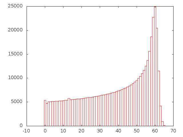
plot "energy.dat" using 1:3 with boxes
Here's another data set from these stopped particles. This one
contains two-dimensional histogram data, binned by X and Z, with the
histogram height being the amount of energy deposited in each X,Z bin.
In this case, let's use the "pm3d" style to colorize the graph based
on the energy value:
splot "xzde.dat" with pm3d
We can tell Gnuplot to also display a color map on the bottom of the
graph. To make this visible, we'll need to lift the surface up a
little. The additional "at bs" tells the pm3d style to colorize both
the surface ("s") and the bottom ("b").
set xyplane 1
splot "xzde.dat" with pm3d at bs
We could place the color map at the top, instead, by saying "at st",
for "surface" and "top". Note that the order matters, since it
controls the order in which the two maps will be drawn, and one map
may obscure the other if we do them in the wrong order (try it and
see).
splot "xzde.dat" with pm3d at st
When plotting colorized graphs, we can control whether or not we
display the color key by typing "unset colorbox" or "set colorbox":
unset colorbox
replot
set colorbox
In the following example, we ask Gnuplot to create a color map on the
bottom surface, and also to plot a wire-mesh (the default) surface
above this:
splot "xzde.dat" with pm3d at b, "xzde.dat" with lines
Sometimes we may just want to see the colormap. As we saw above, we
can get this by typing "set view map". The graph below is colorized
according to how much energy was deposited at each location. We can
see the particles coming in from the left, depositing more and more of
their energy as they slow down and stop.
set view map
splot "xzde.dat" with pm3d
set view 60,30,1,1
I mentioned above that Gnuplot doesn't know about histograms, and
can't automatically bin data for you. It's pretty straightforward to
construct a simple histogram using Gnuplot's functions, though.
Here's an example, using the X value of the particle stopping position
data. In the following, I define a function, "bin(x)", which just
returns the X value of the center of the bin into which a given data
point would fall. We then make use of an ability of Gnuplot's to plot
the sum of all Y values with the same X value.
As X values, we plot bin(x), and for each value we give Gnuplot a
fixed Y value of 1. We mean by this, "1 particle stopped inside the
bin on the X axis". We then tell gnuplot to use "smooth freq", which
is a style that causes Gnuplot to sum all of the Y values at a given X
value, and display the result. We've created a histogram! (We'll
talk more about the syntax of this "using" statement later.)
Here's what it looks like:
# A sneaky way to make histograms:
# See also:
# http://www.inference.phy.cam.ac.uk/teaching/comput/C++/examples/gnuplot/#four
binsize = 0.1
bin(x) = int( x/binsize + 0.5 )
plot "stopping-positions.dat" using (bin($1)):(1) smooth freq with boxes
Up until now, we've read data from ASCII files. Gnuplot can also read
binary files. We just need to tell Gnuplot that the file is binary,
and what kind of numbers are in it. For example, the following
command reads a binary file containing floating-point data (type
"double" in C and Gnuplot parlance). The file was created by a C
program, which wrote the numbers in binary format into the file.
Below, we tell Gnuplot that the file contains a stream of "doubles".
If the file were a different format (say, alternating double and int),
we could tell Gnuplot how to deal with it (say, "format ="%double%int"").
Type "help plot binary general" in Gnuplot for more
information.
# binary data
plot "data.dat" binary format="%double"
As we saw in the histogramming example above, Gnuplot lets us plot
functions of data columns. We specify what to plot with the "using"
qualifier. If we're just plotting the unadorned contents of the
column, we just give the column's number. But, if we want something
more complicated, we can supply a more complicated expression. These
more complicated expressions need to be enclosed in parentheses.
Within these parentheses we can use whatever arithmetic expressions
and functions we want, referring to data by column number. In this
context, the column numbers must be preceded by "$", to distingush
them from actual numbers that we might be using in the expressions.
Here is a pair of examples:
plot "stopping-positions.dat" using 1:($2/100)
plot "stopping-positions.dat" using (sqrt($1**2+$2**2+$3**2))
Sometimes we want to use "line number" as one of the things
we plot. For example, imagine we have a file containing many
measurements of position and time. Each line of the file just
has two values, x and t. If the lines in the file are in the
same order in which we did the measurements, we could think
of the line number as a third value: the "measurement number".
We can use the line number in our plots by referring to
"(column(0))" or, equivalently, "($0)". For example, to plot
position versus line number:
plot "mydata.dat" using ($0):1
A data file may contain more than one data set. In the example below,
we plot data from a file called "bessel2.dat" which contains five data
sets. Each data set is two columns containing x and jn(x), where jn
is the nth order Bessel function. The first data set is j0(x), the
second is j1(x) and so on. The data sets are just concatenated
together, with blank lines separating them.
# Multple data sets in one file, with blank lines:
set xrange [0:20]
set yrange [*:*]
plot "bessel2.dat" with lines
* Inset Graphs:
-------------
Sometimes we want to have a smaller graph inset into a larger one.
Here's a long example that illustrates how to accomplish that in
Gnuplot. Within the "multiplot" environment, we can specify the size
and location of each plot explicitly. In the example below, we create
a large graph by specifying "origin 0.0,0.0" and "size 1.0,1.0".
Multiplot's coordinate system (by default) begins at 0,0 in the lower
left corner of the screen and goes to 1,1 at the upper right. We then
set the origin and size of a second plot so as to place it in the
upper right corner of the first graph.
i(x) = 0.5*(1+erf(x/sqrt(2)))
unset key
unset label
unset xlabel
unset ylabel
unset title
set multiplot
set origin 0.0,0.0
set size 1.0,1.0
set yrange [0.001:]
set xrange [0:3]
set log y
set xtics
set ytics
set grid xtics ytics mxtics mytics
plot 1-i(x), 0.5-(1-i(x))
set origin 0.7,0.7
set size 0.3,0.3
f(x) = exp(-x*x/2)/sqrt(2*pi)
g(x) = x>=1?f(x):sqrt(-1)
h(x) = x<=1&&x>=0?f(x):sqrt(-1)
set xrange [-3:3]
unset log y
unset grid
unset xtics
unset ytics
plot g(x) with filledcurves x1,h(x) with filledcurves x1, f(x) with lines
unset multiplot
set xrange [*:*]
set yrange [*:*]
set origin 0,0
set size 1,1
unset grid
set xtics
set ytics
* Writing Output Files:
---------------------
When you start Gnuplot and begin graphing, Gnuplot chooses one of
several ways of displaying the data, depending on the abilities of
your computer's display. Each way of displaying the data is called a
"terminal type" or "term" in Gnuplot. If you're using Gnuplot under
Linux, you'll probably be using the x11 or the wxt term. You'll see a
message when you start Gnuplot that says something like "Terminal type
set to 'wxt'". Both of these terminal types are used for displaying
graphs on your computer's screen. You can see what the current
terminal is by typing "show term".
There are other terminal types that are intended for creating graphics
files. For example, you can use the "png" terminal to create png
files, or the "postscript" terminal to creat postscript files.
In the example below, we change the terminal type to "postscript"
using the command "set term postscript enhanced color". The "enhanced
color" part specifies some options available in the postscript
terminal type. If we tried plotting a graph at this point, we'd see
postscript commands printed on our screen. We don't want that! The
next thing we need to do is to tell Gnuplot where to write these
postscript commands. We do this by using the "set output" command.
Note that the name of the output file must be enclosed in quotes.
Anything we subsequently plot will be written into this file as
postscript data. You can see the result here.
set term postscript enhanced color
set output "gnuplot/images/file.eps"
plot "energy.dat" using 1:3 with boxes
We can similarly send output into a png file, with a result visible
here.
set term png
set output "gnuplot/images/file.png"
replot
Many terminal types allow you to use special symbols (e.g., Greek
letters) in titles and labels. Unfortunately, the way to do this
varies greatly from one terminal type to another. For example, to
produce a lower-case Greek sigma with the postscript driver, you could
insert the string "{/Symbol s}" in your title. For the png terminal,
you'd need to insert a unicode symbol by typing an appropriate
sequence of keys on your keyboard. For one of the Latex terminal
types, you'd need to use Latex-style equations.
A useful cheat-sheet for this kind of thing can be found here.
* Fitting functions to data:
--------------------------
Gnuplot also allows us to fit model functions to data sets by
searching through parameter-space to find a set of parameters that
minimize the chi-squared value obtained by comparing the given model
to the data set.
For example, consider the following data set, which contains some data
that appears to be distributed in something like a Gaussian
distribution.
set xrange [*:*]
set yrange [*:*]
plot 'h_200.dat' using 2:3:4 with errorbars
We can define a function that represents a generalized Gaussian
distribution, characterized by three parameters: "s" (the standard
deviation), "m" (the mean) and "a" (an amplitude). We define such a
function, g(x), below. Gnuplot is capable of adjusting the values of
a, m and s in order to find the best fit to a given data set. Gnuplot
isn't particularly good at guessing good initial values for these
parameters, so we should set them by hand to some approximate values
before asking Gnuplot to adjust them. In the example below, we just
read approximate values from the graph, without too much care.
Then, we use Gnuplot's "fit" command to adjust the parameters a,m and
s to find a minimum chi-squared.
g(x) = a*exp(-(x-m)**2/2/s**2) # Gaussian
a=25
m=100
s=15
fit g(x) 'h_200.dat' using 2:3:4 via a,m,s
The output of the "fit" command will look something like this:
After 5 iterations the fit converged.
final sum of squares of residuals : 11.2835
rel. change during last iteration : -4.51108e-07
degrees of freedom (FIT_NDF) : 22
rms of residuals (FIT_STDFIT) = sqrt(WSSR/ndf) : 0.716162
variance of residuals (reduced chisquare) = WSSR/ndf : 0.512888
Final set of parameters Asymptotic Standard Error
======================= ==========================
a = 16.3064 +/- 1.084 (6.645%)
m = 99.7578 +/- 0.5116 (0.5128%)
s = 9.36694 +/- 0.4236 (4.522%)
We can then ask Gnuplot to draw the best-fit function (using the
newly-obtained parameter values), along with the data:
plot 'h_200.dat' using 2:3:4 with errorbars, g(x)
* Using text as axis labels:
-------------------------
It's sometimes useful to be able to use text as axis labels.
For example, you might have a file like this:
Joe 1.00
Bob 2.45
Mary 3.14
Jane 0.76
You could plot these values with the names as labels by typing
the following in Gnuplot:
plot "file.dat" using 2:xticlabels(1) with boxes
If the labels are so long that they bump into each other, you
can rotate them by issuing the command:
set xtics rotate by -90
If you do this, you may also need to reduce the height of
the graph to leave vertical room for the labels. This can
be done with a command like:
set size ratio 0.7
* Using dates and times in data sets:
-----------------------------------
Finally, Gnuplot is capable of reading date and time data in
data files, and plotting them appropriately. For detailed
information, type "help set xdata" and "help set timefmt"
inside Gnuplot. One quick example is shown below. In it,
we tell Gnuplot that the X values will be times, and that
their format in the data file will be abbreviated month names
(like "Jan", "Feb", etc.) Then we tell Gnuplot to mark the
X axis with labels in the same format. After that, we only
need to tell Gnuplot to plot the data in the file.
set xdata time # Tell Gnuplot that the X values will be times.
set timefmt "%b" # Tell Gnuplot what format to expect in the data file.
# See man strftime for codes.
set format x "%b" # How axis will be displayed.
plot "mail-stats.dat" using 1:2 with boxes
|
